Form & Builder Type Patterns (pt 1)
Form and builders are the staple of a content creation and saas product. As a byproduct of rapid growth and an expanding team, forms quickly became messy and fragmented between orgs. This is problematic for the obvious reasons:
Broken ux between products that have a similar function
Not scalable since form patterns were not defined
Designers and engineers spending way to long reinventing the same form over and over again 😱
Stakeholder frustration
where to start?
With a team of 30 designers punching out dozens of feature updates regularly, I decided to only collect forms files from the last quarter. In collaboration with designers I was able to collect most of the major form patterns and drop them into a FigJam (yes, I did max out the file).
Over several weeks, I was able to identify and categorize the different forms that we had and their access points. Can you guess how many there were? A LOT is the answer.
Here is the abridged version of the breakdown:
Entry points:
Full screen dialog
Lightbox overlay modal
Bottom sheet
Form types:
Single/inline column
Singular or segmented panel
Preview forms (2-column)
Read only preview
Progress preview
Live Fetching preview
Asset Editor preview
Multi-step Wizard Builder
Yeah, thats a lot of different types. All these variations of forms and form builders account for 5 of our product suites.
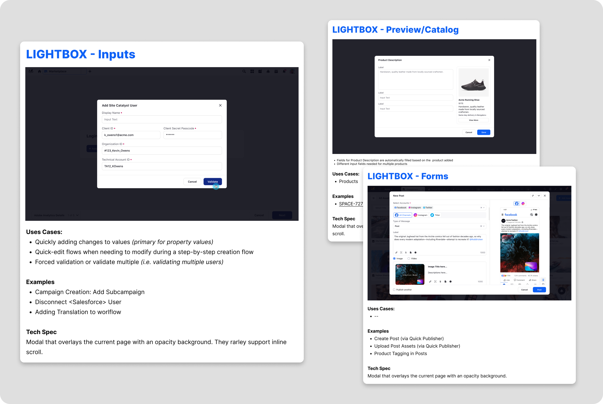
lightbox overlay forms & builders
A lightbox overlay UI is a user interface pattern that displays content in a focused, modal window on top of the existing page. Pretty self explanatory if you’ve been in product for a minute. We found that we have 4 different types of overlays.
The most common naturally being a basic input form and a prompt dialog. We see this a lot of centralized focused authorizations, login auth and quick access data inputs.
Prompts are triggering an action which needs to be validated like deleting actions or creating additional segments.
The other two instances that we found were quick access marketing and social posts. These are the 'fact access’ version of setting up a full campaign, without all the logic behind it. These are closer to the ‘builder’ family since they utilize live fetching and an iframe with a preview window that dynamically updates while you work.
bottom sheet & Single Sheet
Bottom sheets were somewhat limited in use cases. At the time when we were developing this feature we had few cases and they usually revolved around generating some kind of note or message idea that would be attached to either a customer profile or marketing campaign.
Future state (at the time) was being able to access the single column forms, inside of a bottom sheet mechanism for ‘quick access’. That way a user would never have to leave their current page to create an object/campaign.
And of course we have our business as usual, single column form that usually presents itself in a full screen dialog.
Across all 5 products, all of which do very different things, establishing just how a user may access a form and/or a builder was a huge milestone in the journey to consistent UX. Our customers who had 3-5 of the product suites noticed right away that the behavior and entry point was way more intuitive and it felt like a cohesive all encompassing product.
Part two: WHAT goes into these things?!


