Hyperspace Design System
Hyperspace 2.0 component gallery
About
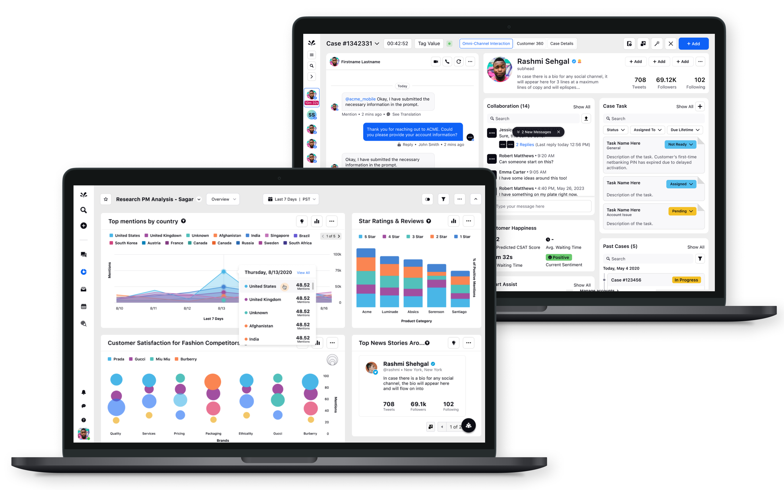
Sprinklr is a CXM B2B Saas company that enables thousands of the world's largest enterprises use to market, advertise, research, care, and engage consumers leveraging powerful Ai. The suite of products allow users to implement social media strategy across multiple businesses, measures and manages sales, marketing, customer service, events and crisis management.
Role
Design System Manager
Team
Product Designer (myself), 2 FE Engineers, VP & AVP Product Design
Platform
Web
Timeline
November 2021 - July 2023
Tools
Figma, Figjam, Jira, Microsoft Suite
key metrics
⬆︎ CSAT Product Designer score on usability of the Figma DS
⬆︎ Trend in Product Designers confidence in using the proper component/pattern
⬇︎ 75% drop in Accessibility bugs
⬇︎ Trend in repetitive comments in Figma from design leadership
⬇︎ Average 2-3 days saved in Product Design design cycle time
Overview
Build, refactor, document and scale Hyperspace 2.0 design system components inside of Figma libraries in addition to establish a cohesive relationship and operating cadence with engineering. Help drive adoption and usability of design system across product design and engineering. Enhance and elevate the UI to a more modern, easy to use design.
Where to start?
Research & Observation
To know where I needed to begin I started heavily with research and observation. Hyperspace design system existed prior, understanding what the team already had was integral to knowing where and what I would start on. I read through the internal component site that was heavily influenced by Uber’s Base design system. Studied how the Figma space was laid out and categorized and sat in many design reviews to learn the design culture. Observation informed me how most designers and engineers were accessing the Figma libraries and how designers found and pulled in components.
Audit
As my research and observation started coming together I ran an audit on a handful of categories, some examples were:
Foundations and general maintenance — Colors, typography styles, grid; the basics
Figma architecture — Are the pages laid out intuitively? Are they matching development semantics?
Components — which components are the most needed and most used
Considerations
Working as the only design system designer meant that I had some limited time developing the Figma side of the design system. I couldn’t spend months of developing the perfect strategy, so I had to take an iterative (very iterative) approach. Thankfully, Engineering had standardized many of the foundations such as color, scale, grid and icons so I had a solid base to work off of.
Working with engineering and design leadership stakeholders, we worked towards just getting the information in one centralized area for designers and just getting the information out there.
Setting it up
Foundations
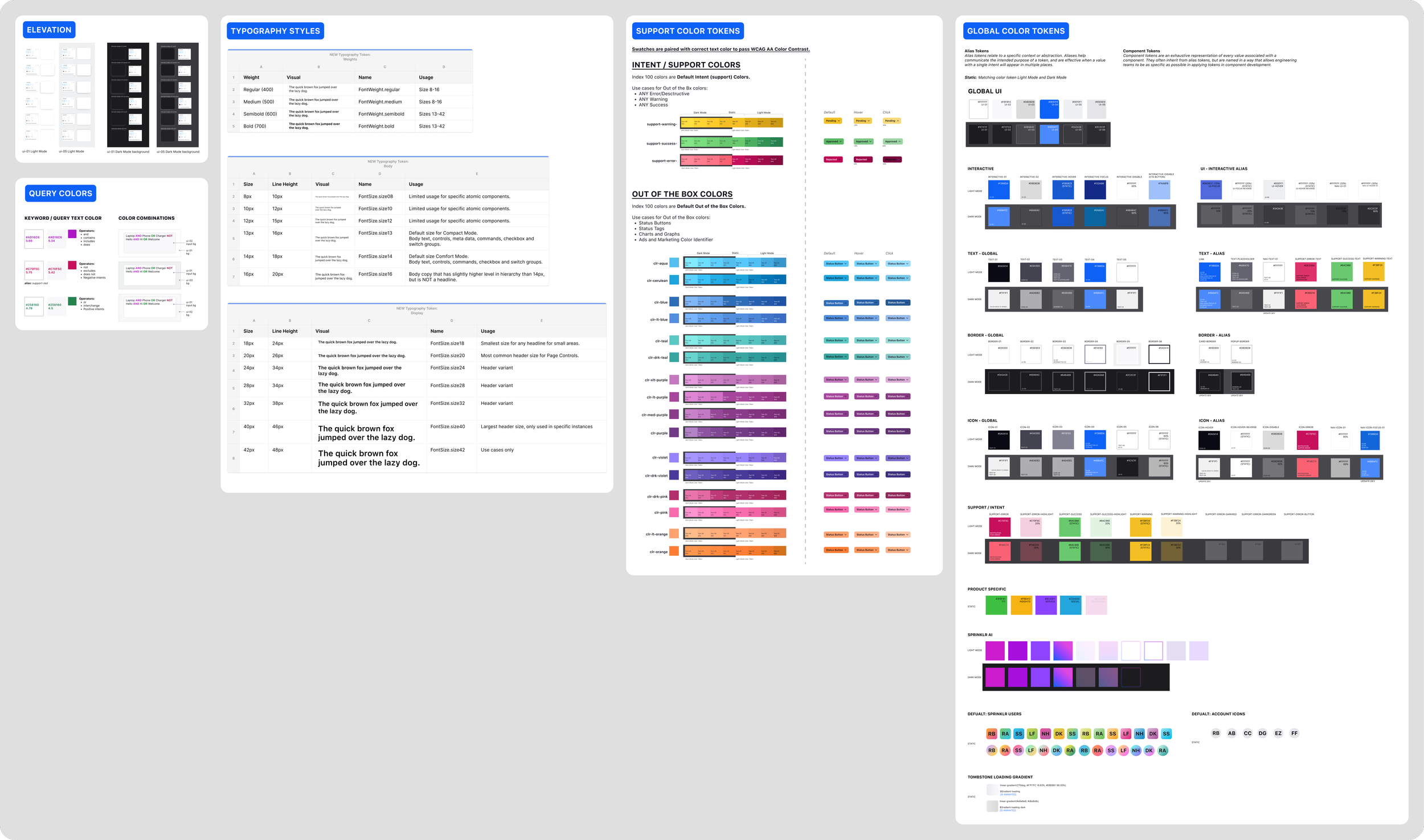
Get the colors, typography and atomic components consolidated into a source file and published. As the product design team expanded, the ‘source of truth’ quickly fragmented into different Figma locations and files.
Working with Engineering and referencing our internal code repository helped designers confidently use the correct color implementations in their designs, which lead to faster design reviews and a more frictionless dev handoff.
This was strategically the wisest start since these elements are propagated inside of every product and domain. An added bonus to starting off with the foundational elements, I was able to run an accessibility audit, easily identifying fixes that were within scope and would benefit the business as we were adding more Fortune 500 companies to our client list. Check out this blog post about it.
Color and Typography palettes/styles
Atomic Figma Library
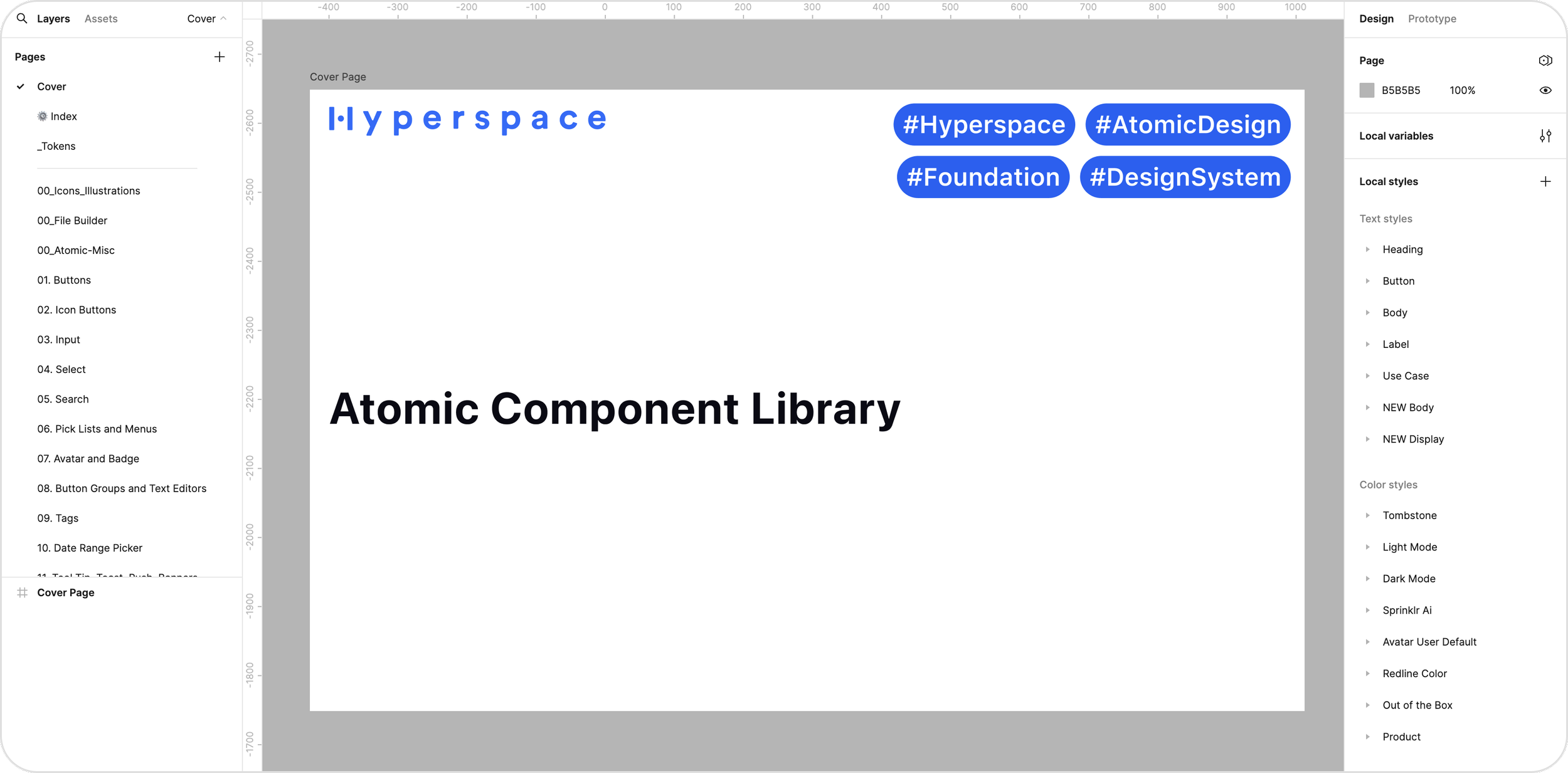
Pages inside of the Atomic Figma Library
Following a similar model to Brad Frost’s Atomic Design, we modeled our Figma structure similarly and built all smaller components into its own library. Pages inside of the Atomic Figma were semantically named to also match the internal repository site, creating parity between Figma and code.
Semantic naming between Figma and Repo site
Building components
Every design system builders dream is building a ton of components, but the hard part is how to make them intuitively composable while still maintaining some parity between code and our Figma design tool. Although Figma does a LOT to streamline code and design, sometimes it is not always 1-1 transferrable.
Thankfully, the most common component for a saas product is form control, which was easy enough to build inside of Figma while also closely aligning to code.
Form control Figma input
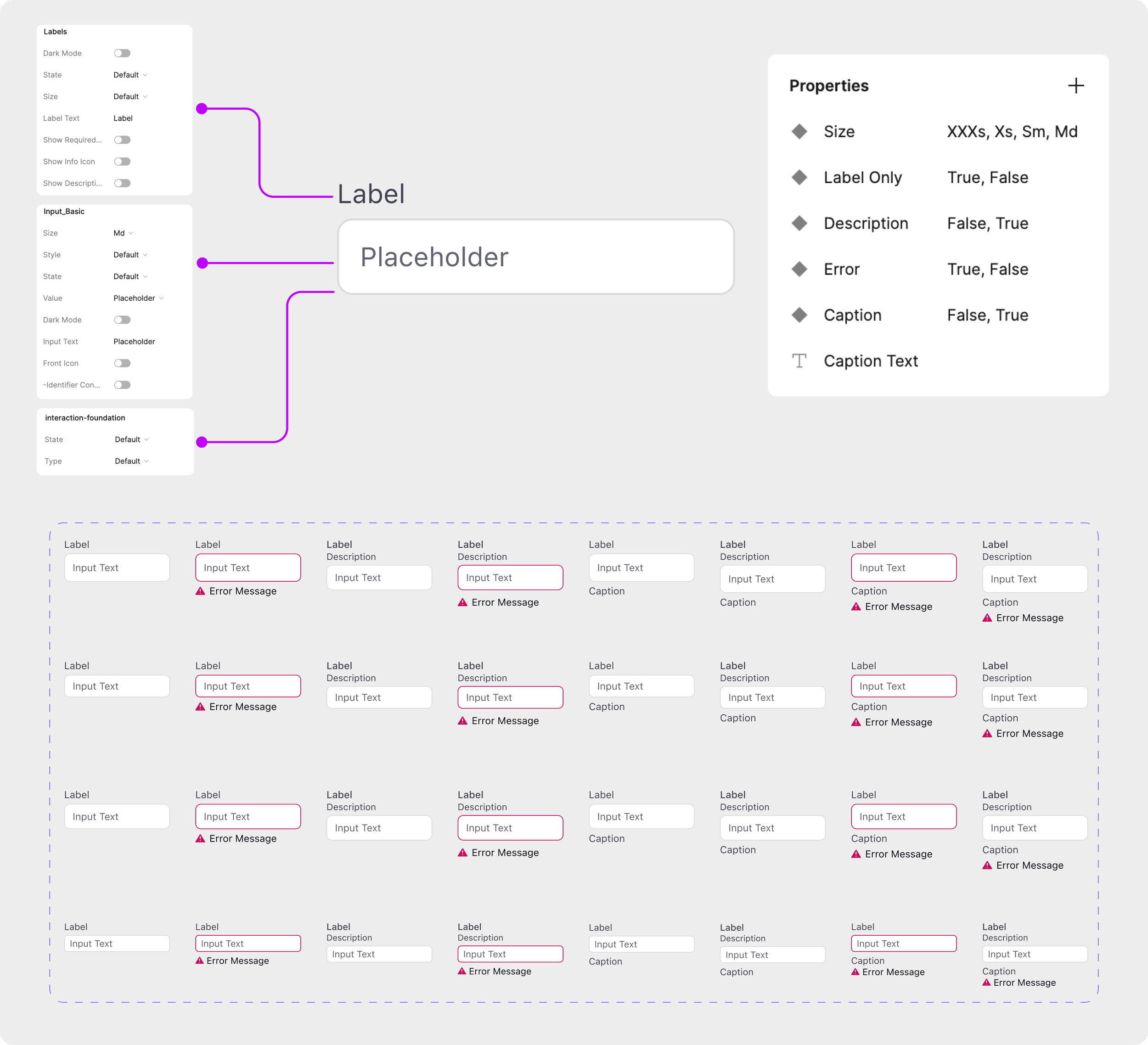
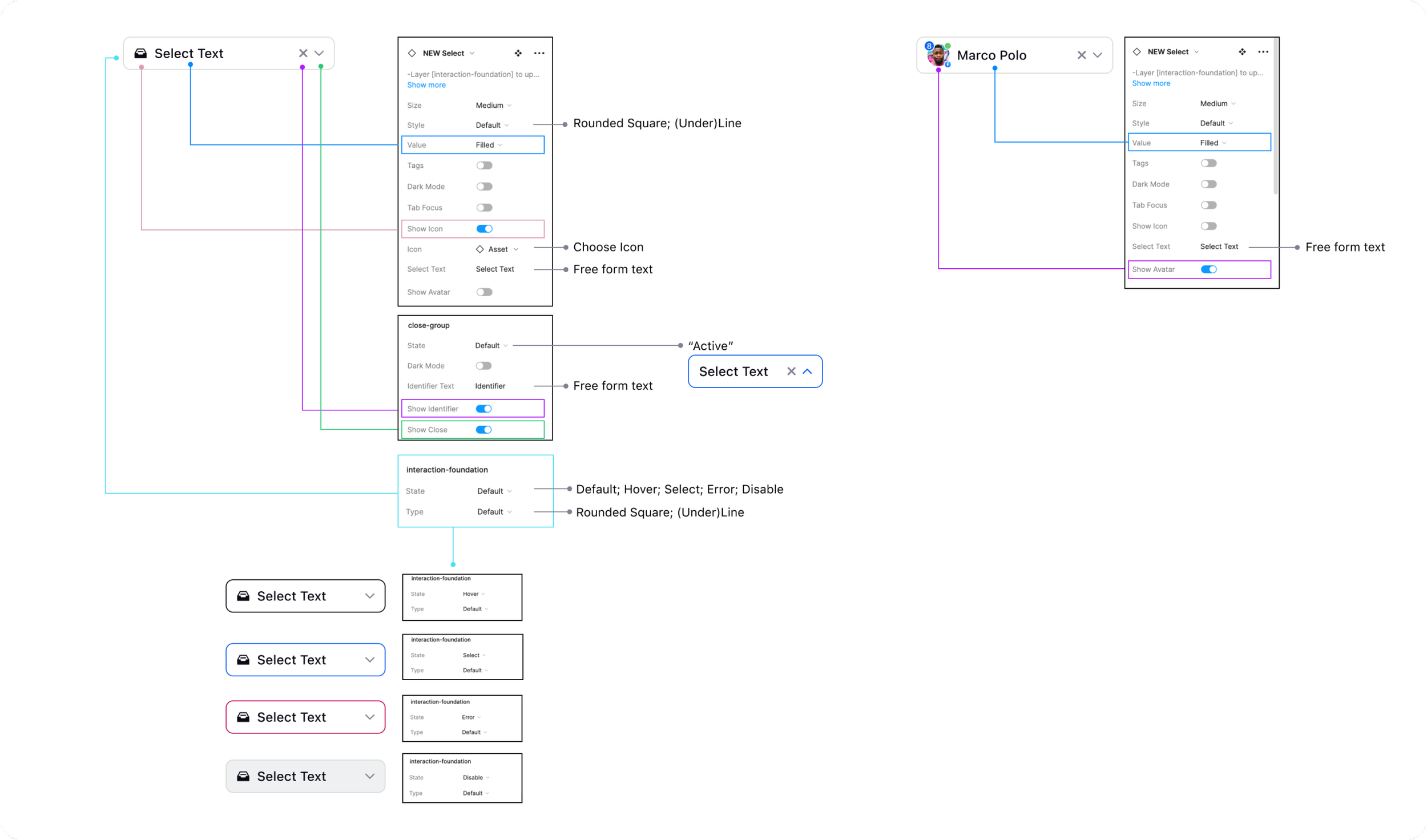
Figma component usability key
Building the components is not always the hardest challenge, it’s providing designers instructions on how to use them. For the more complex components such as an input that could support props and adornments as well as interactive states and style variants, I created an educational component key. In the key I annotated what each boolean and property does and what options there are*. Paired with educational Figma Office Hours, designers quickly learned how to best use components inside their own designs enabling them to move faster with less friction and component blockers.
*Pre-release of updates to property types and variables
Scaling the atomic library
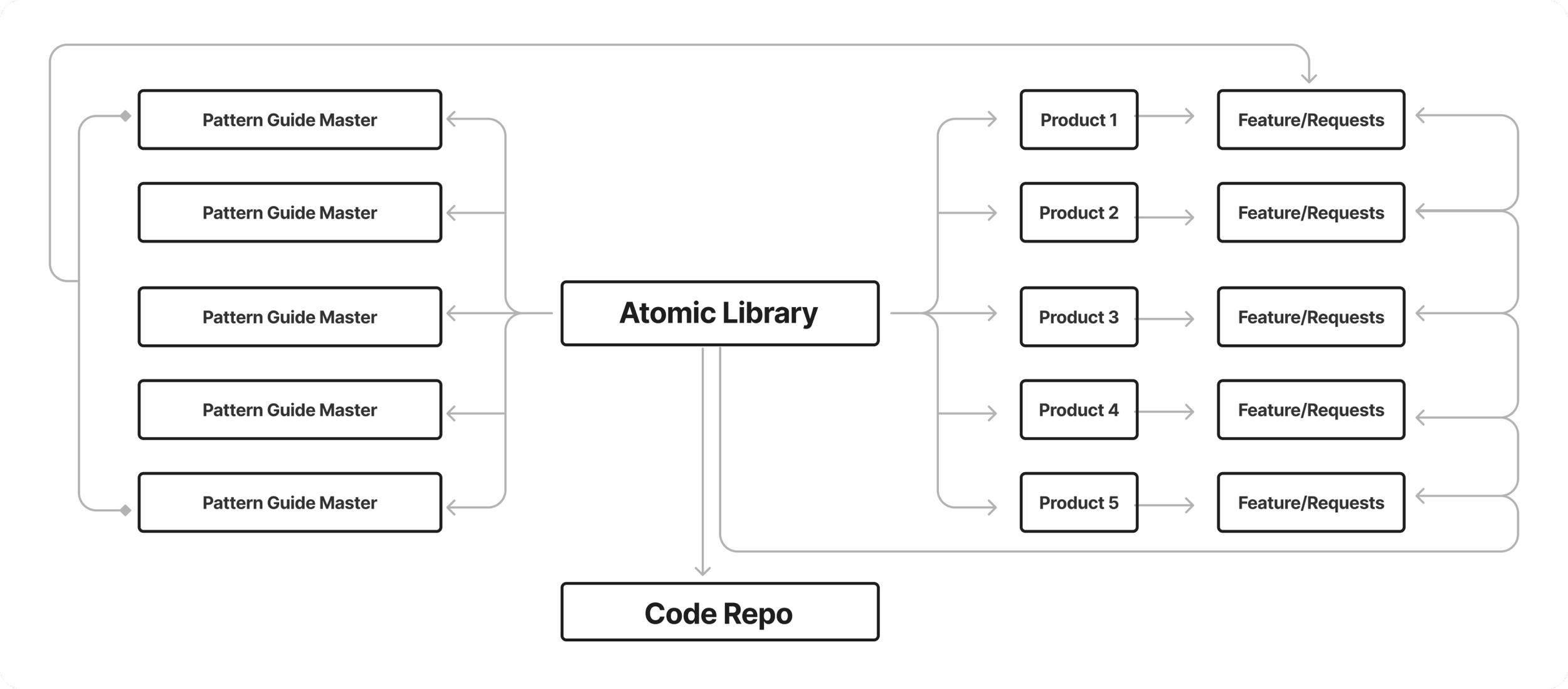
Information architecture of Figma libraries
Once the Atomic Library had a healthy status, I took that library and propagated out major pattern libraries such as Forms, Tables, AI, specific product areas, etc. By connecting the Atomic Library to many other pattern source files, I quickly was able to align product designers of proper use of components and patterns spanning horizontally across 5 products.
The Results
In my time at Sprinklr working on Hyperspace Design System, here are the major wins:
Product Designers and Engineers had a source both in code and Figma that they could rely on for well maintained components
Product Designers design cycle time decreased while boosting confidence both in their product area and the work
Design leaderships review time decreased with the consistent use of the design system
Addressed global accessibility issues, decreasing the amount of A11Y bugs by 75%
Built stronger working relationships with engineers and improved design compliance in production
What people are saying
I have the pleasure of working closely with Katie and can confidently say that she is an invaluable asset to any design team! She has consistently demonstrated an extraordinary level of expertise in managing and maintaining our design system. Her meticulous attention to detail and ability to streamline design processes have significantly improved our team's efficiency and productivity.
In addition, she goes above and beyond to support and mentor her colleagues, offering guidance and patiently assisting them in utilizing the design system effectively. Her excellent communication skills and ability to simplify complex concepts make her an invaluable manager to junior designers, fostering their professional development.— Amber Weng, Principal Product Designer
We are literally still surviving on all of the design system work you did! thank you so much! Just wanted to tell you that all your work has saved us! ❤️
— Devanshi Brower, Product Designer II

